by MONIKA NORWID
photography GIULIA VENANZI
coordination CONCETTA D’ANGELO
1.2
I was on the Upper East Side of Manhattan on a cold Autumn morning, holed up in a waiting room at an emergency animal hospital, when I got a text: Britt Moran of Dimore Studio was on the other side of the Atlantic awaiting our Skype interview—was I ready? Our meeting had been scheduled for five pm that afternoon, yes—but five pm Milan time, meaning RIGHT NOW my time. I handed my ailing dog to a nurse, sucked up a sting of tears, and looked around frantically for a background against which to present my video self.
Any other interview, I would have cancelled. I was in no state to carry on a conversation, let alone wing one that I’d been looking forward to for weeks. But I walked down the hall, past giant backlit posters of vets with grateful, pawing cats and canines, along a terrazzo floor and walls lined with industrial brick, my heart simultaneously bursting with loss and bracing with resolve. I found my spot. Strangely, it didn’t seem at all incongruous to talk about Dimore right then and there. In fact, I suddenly wanted to. The absurdity of life is precisely what the studio’s interiors are uniquely able to articulate, and in doing so, to make room for, to give permission to—to seemingly understand. Their spaces accept chaos, but on their terms, putting it in its place, in a state of playful, meaningful suspense. “It is everything,” said one commenter, on a blog featuring the famous Dimore kitchen with the brass cube. Nothing about the world is denied. The show—the whole show, in all its madness and mystery—must go on.
Lately, Dimore Studio seems to be everywhere: on covers of magazines featuring the latest hotel, restaurant, apartment; in stories featuring their own studio space, which seems to get a media massage every time they move an object or change a light bulb; on covers featuring not their work, technically, but such obsequious imitations of their work that you’d be forgiven for thinking, at least at a glance, that you’re looking at the original. Dimore mania is officially upon us.
What is it about their vision that seems so perfectly tuned to our time, at once so inevitable and yet seemingly inexplicable (even to its founders, Britt Moran and Emiliano Salci)?
I did not interview Britt Moran in the back hallway of the animal clinic after all—his schedule, too, required a last minute rain check. When we finally sat down to talk over Skype, the man on the screen seemed to embody the sharp contrasts his company is known for: a boyish blond’s face with a tender whisp of a smile, set in relief against a surprisingly deep, professorial voice. I told him about the missed chance to interview him from a back staircase at a vet clinic. He laughed, but then nodded emphatically when I mentioned the strange feeling of aptness in those emotionally charged surroundings. Where did that current come from in their work, I wanted to know.
“With every project that we begin and that we approach and we accept to do, we’re always very enthusiastic about the project itself,” he says, with a low-key, self-effacing graciousness that has the priori deflection of the suddenly, reluctantly famous. “Usually the people who contact us already know our work very well, and immediately we’re able to create a relationship with them. So it does become a bit emotional for us as well.” But, with a mischievous smile getting the better of him, he gives away a blunt truth: “Emotional, in good ways and bad ways. Because obviously, we confront ourselves with the client often, so there’s a lot of emotion around the project itself.”
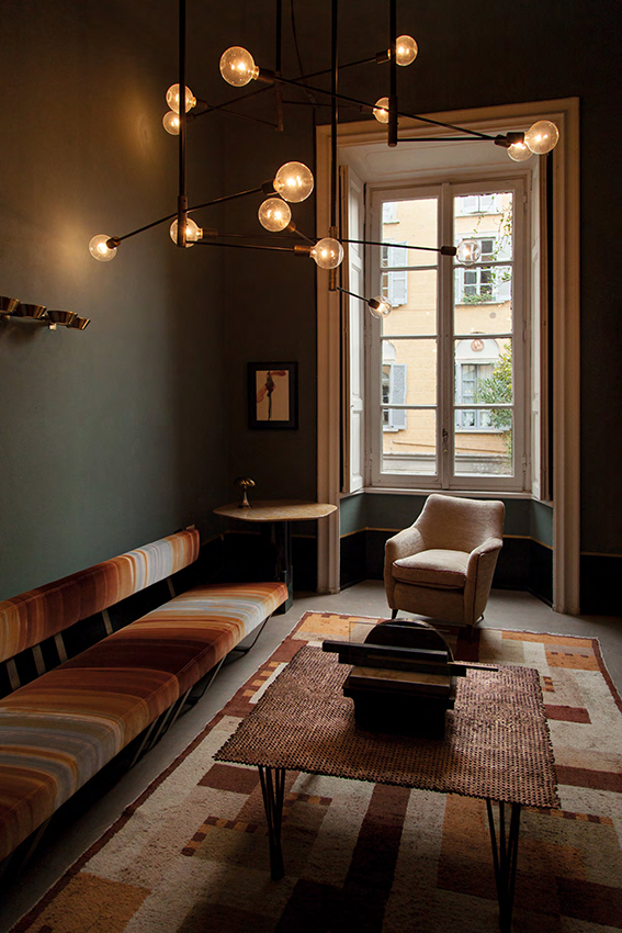
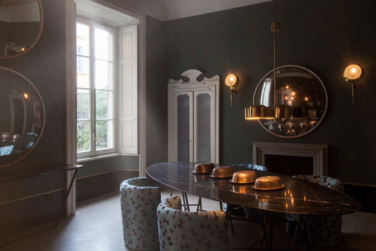
The first signature talent of a Dimore space is that it doesn’t play nice. Transcending tasteful solutions, a Dimore room is in a state of constant, invigorating tension, boobie-trapped with risky propositions that are then left hanging for our imaginations to get hooked on. A bookshelf in brass is leaned against a wall. A giant cistern gapes malevolently in the middle of a room. Dimore’s trademark color scheme is often called moody. But it’s the battle between the dark and the light that triggers an oscillating energy. There’s no one theme here to adapt to, dress up for or pose in. Dimore’s immersive experience requires constant, shifting response and reevaluation.
How do they do this? Disrupting expectations.
Another unusual technique of the studio is their canon of confusion—a set of rules that instead of reinforcing what we expect of “good design,” completely strip away and defamiliarize our eyes. The goal is not (merely) good design, but beauty. For that, design must take a back seat. By transcending the lazy reliance on “important pieces” customary in high-end interiors, Dimore raises the bar in general, obliterating signifiers of value or sophistication and defamiliarizing the expected at every turn. Without context, design must stand on its own, and we on our own within it, no safety nets allowed. The risk, of course, is that we won’t get it, or that it won’t captivate us. In abstracting their work beyond the catchy hooks of taste, Dimore is taking the biggest risk of all: putting interior design itself, as a concept, at stake. Does design even matter once the external trappings and projected meanings of lifestyle fantasy, class, status or provenance are removed? Can design hold its own in the world, on its own terms, with inherent value? It’s a trick question, of course, because the implication is: can we?
The risk in their kind of freefall is big, but the pay off is worth it. Dimore spaces exude a liberating confidence that is addictive, infectious, invigorating. Seeing a mere photo of one of their interiors makes any other seem shrunken, ingratiating, timid, silly, desperate to please by comparison. The eye feels suddenly aware of the possibilities inherent in a space, and feels downright cheated by the mere good taste, smug trendiness and elegance of even the finest interiors.
To create new meanings, one has to begin with a profound understanding of the established ones. Milan, in this sense, is the Torah of interiors. Besides the annual fair that is to design what Basel is to art, the city has of late become a bubbling, sputtering design laboratory, with companies such as Nilafur and Eclecttio rumaging through the vaults of the greats to pull those important pieces that have the most chemistry with today’s cutting edge designers, fusing the significant with the irrepressibly nervy spirit of the Italian perfectionist, and thus contributing ideas to the rest of the world from such innovative thinkers as Nilafur’s Nina Yashar, Eclettio’s Claudio Loria and Vincenzo de Cotiis.
But there’s an even bigger departure from the status quo that sets Dimore fundamentally apart and above their peers.
Architecture. Decoration. Traditionally, these have been two separate entities that are allowed to work together only with great control and discretion, but are often kept, with good reason, apart. It’s hard to keep one from undermining the other, or each from getting in the way of the other’s job.
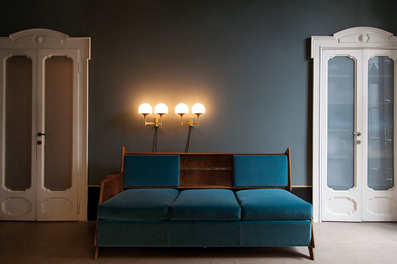
The first remarkable trick that the work of Dimore Studio pulls off is to invert the Architecture/Decor formula—not only fusing but confusing the two, making decor do the job of architecture, and architecture serve the role of decor. Walls become embelishments used for the display of color and light, while lighting fixtures and furniture form the size, depth and volume that defines “spaces.” The permanent features of the building are props or backdrops for the inherent structure built from an arrangement of objects. Like the revolutionary artist Diaghilev had done with his Ballet Russes in turn of the century Paris, the radical minds and unfettered instincts of the duo behind Milan’s leading design firm are inventing a new language for their medium, reforming the very alphabet of how we express space.
WHY is this so important? Because it gives new value and meaning to things that have been considered “ephemeral,” and it gives new ephemerality and flexibility to things that were once considered “permanent.”
Fixed spaces no longer have seniority or authority because of location or function; we are becoming nomads again, sharing and converting. Just because you can’t move something doesn’t mean it can’t be transformed, nor does it mean you’re trapped in it. Just because you can move something, doesn’t mean it’s a disposable commodity that can be bought and sold without major consequence to your environment.
The onus is on an intentional attachment as the permanent force, on a choice of belonging to rather than owning or acquiring—a permanence based on emotion and creation of beauty rather than on ownership of property. Foregoing the accidental fact of the fixed—our space, place, time, class—we replace it with a new kind of permanence, through the intentional act of attachment, in choosing what belongs to us and what we belong to, not what is owned by us or what owns us in turn. It is a new psychological home, for a new society where everything physical that we’ve known to be permanent is actually coming undone, melting away, being gentrified, eminently domained.
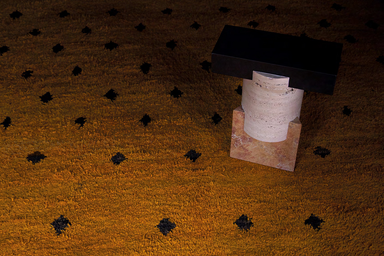
The “Tuskan Kapital” stool stands as a functional totem on the ochre carpet. The stool is a reductive form of the typical echinus and abacus, and is featured in “Nero Assoluto” stone, travertine and “Giallo Reale” marble. It’s a 2014 creation by OEUFFICE, part of an exclusive collection realized for Dimore Gallery.
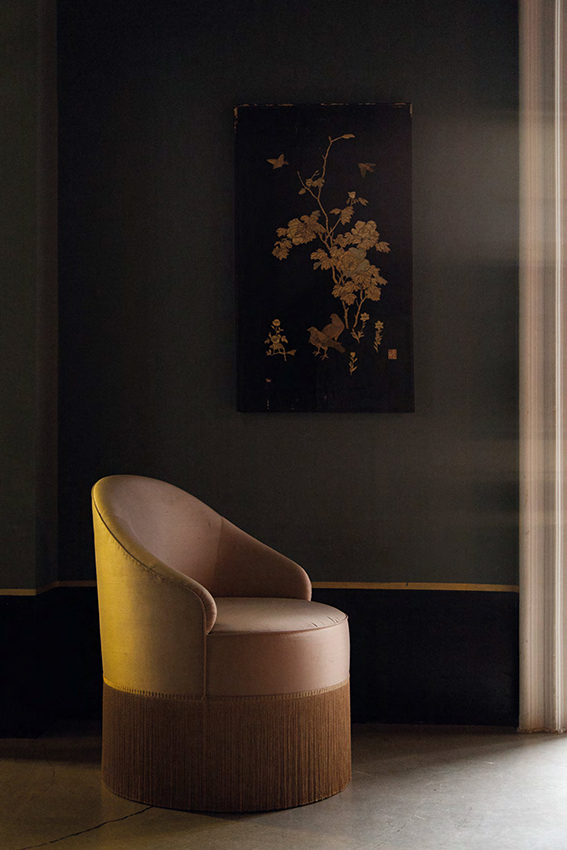
A club chair caresses the floor with its delicate fringes, and is upholstered in dust pink silk. It’s a design from DIMORESTUDIO. The object contrasts with the dark walls not only painted but confidently detailed with an even darker color at the base, to ensure that each tone’s charisma is brought out by the other. The mood is completed by a Chinese decorative panel in black lacquered wood with ivory and mother of pearl decorations of branches and birds belonging to the Dimore Gallery’s Heritage selection.
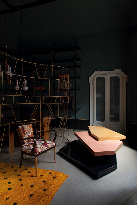
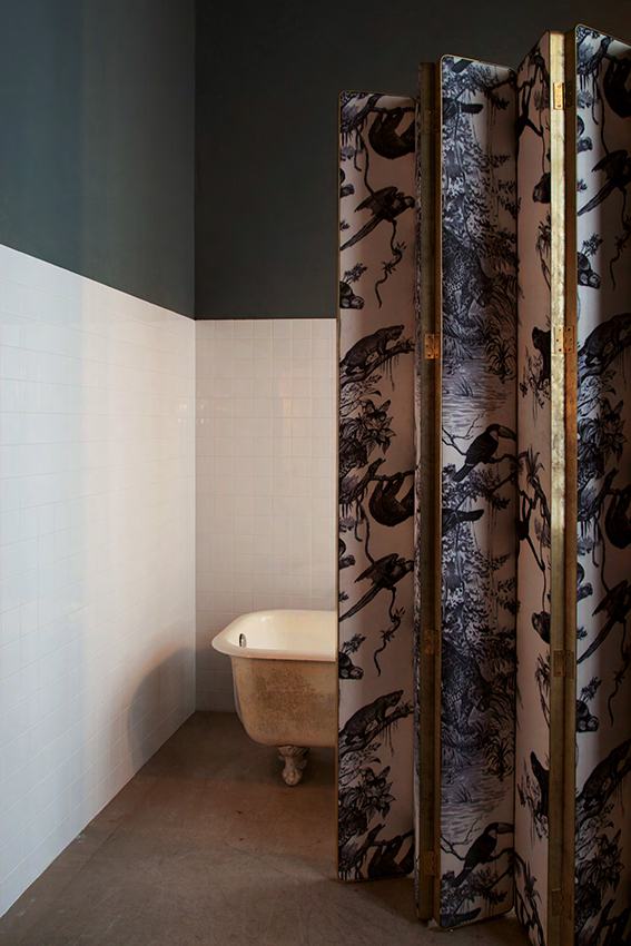
A low table consisting of shards of lacquered pastel forms the asymmetrical core in a centrifuge of patterns and purposes. Its overpowering presence is embraced by the sinuous curves of the oxidized brass screen, which creates a voyeuristic separation of the space. Both the pieces belong to the “Progetto Non Finito” collection by DIMORESTUDIO. The dotted sunflower-yellow rug placed beneath a leaf-strewn burgundy fabric chair is the playful comic relief to a severe, assertive wall unit of sharp angles and hard planes. Both pieces are part of the Dimore Gallery’s Heritage selection. In the background, the wooden library with modular shelving system is a design by DIMORESTUDIO, while, from Dimore’s Heritage selection, a vintage pair of ceiling lamps with opaline glass stand over table and chairs in laminated wood coming from the 1975 “Artona” series by AFRA E TOBIA SCARPA.
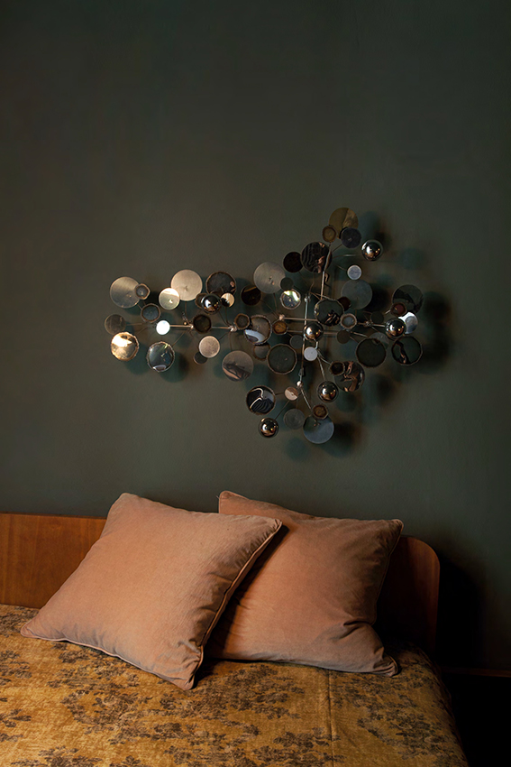
The bedroom embraces a melancholic and intimate atmosphere through the sincere wooden bed covered with a silk floral counterpane, designed by FRANCO ALBINI in 1950. This touching simplicity is reinforced by the contradictory futuristic style of JERÉ CURTIS “Raindrops” wall-sculpture, made of punched and torch-cut polished chrome discs and domes. Both belong to the Heritage selection of Dimore Gallery.
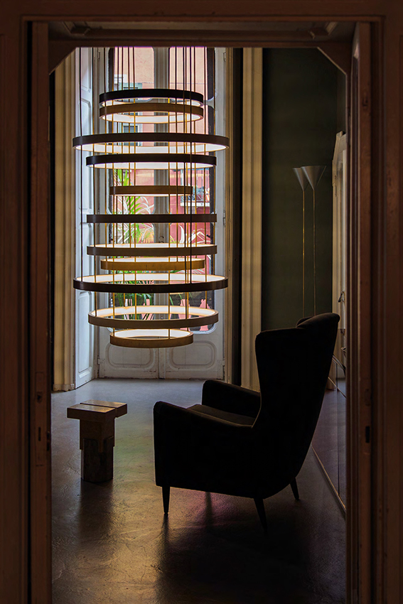
The door frame opens to a perturbing presence, a slinky-like lighting sculpture that could have come straight out of one of Tesla’s experiments. This object commands a dynamic attention and interaction from all objects present, humans included. The magnificent ceiling lamp belongs to the “Progetto Non Finito” collection of DIMORESTUDIO. In the meantime a silent dialogue seems to take place between the silhouettes of a GIO PONTI precious velvet armchair, originally designed in 1945 for a bourgeois Milanese private residence, and the “Ionik Kapital” marble stool exclusively created by OEUFFICE for Dimore Gallery.
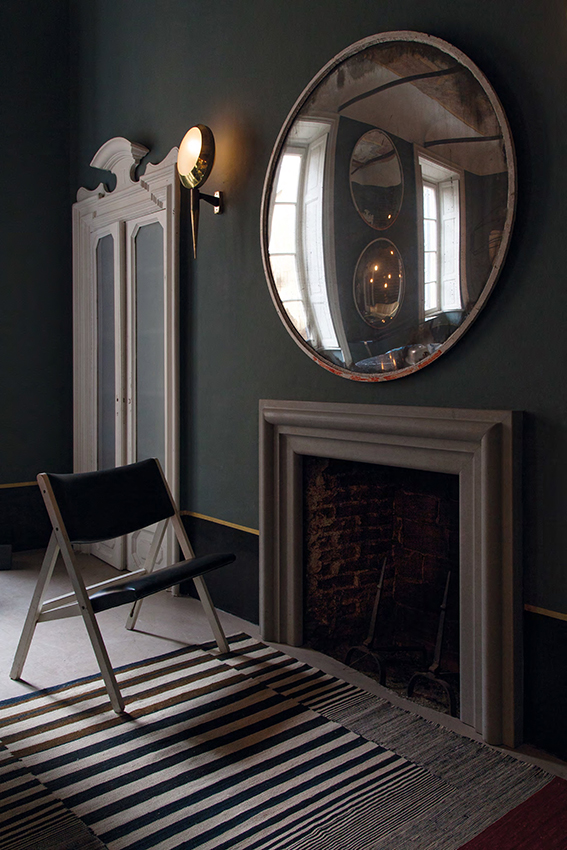
A lesson in scale and asymmetry, Dimore’s take on laid-back ease is a poised, though never posed or imposed, disruption of balance. The center here is clearly demarcated by three points, mirror, fireplace and rug, and then radically destabilized by a lopsided attention to the stark-white door frame. The foldable chair designed by GIO PONTI in 1967 will here float as needed, taking sides according to the moment. The STILNOVO rare wall-lights made of glossy brass and opaline glass complete the environment. All belongs to the Heritage selection of Dimore Gallery.


